Wednesday, January 29
You can also download a PDF copy of this lecture.
The Estimated Expected Response
Assuming the linear model E(Y)=β0+β1x1+β2x2+⋯+βkxk, the estimated expected response at specified values of the response variables is ^E(Y)=ˆβ0+ˆβ1x1+ˆβ2x2+⋯+ˆβkxk, where x1,x2,…,xk are specified values of the explanatory variables. Because ^E(Y) is sometimes used for predicting Y, we sometimes refer to it as the “predicted value” of Y and denote it as ˆy.
Note that an expected response is simply a linear combination of the form ℓ=a0β0+a1β1+a2β2+⋯+akβk+b, where a0=1,a1=x1,a2=x2,…,ak=xk and b=0.
Example: Consider the following model for the
whiteside data.
m <- lm(Gas ~ Insul + Temp + Insul:Temp, data = MASS::whiteside) # note :: operator
summary(m)$coefficients
Estimate Std. Error t value Pr(>|t|)
(Intercept) 6.8538 0.13596 50.409 7.997e-46
InsulAfter -2.1300 0.18009 -11.827 2.316e-16
Temp -0.3932 0.02249 -17.487 1.976e-23
InsulAfter:Temp 0.1153 0.03211 3.591 7.307e-04What is the estimated expected gas consumption at 0, 5, and 10
degrees C after insulation? Either lincon or
contrast can be used (although contrast is
probably easier).
library(trtools)
lincon(m, a = c(1,1,0,0))   # After @ 0C
estimate se lower upper tvalue df pvalue
(1,1,0,0),0 4.724 0.1181 4.487 4.961 40 52 9.918e-41lincon(m, a = c(1,1,5,5)) # After @ 5C estimate se lower upper tvalue df pvalue
(1,1,5,5),0 3.334 0.06024 3.213 3.455 55.35 52 6.772e-48lincon(m, a = c(1,1,10,10)) # After @ 10C estimate se lower upper tvalue df pvalue
(1,1,10,10),0 1.945 0.14 1.664 2.225 13.89 52 3.869e-19contrast(m, a = list(Insul = "After", Temp = c(0,5,10)),
cnames = c("After @ 0C","After @ 5C","After @ 10C")) estimate se lower upper tvalue df pvalue
After @ 0C 4.724 0.11810 4.487 4.961 40.00 52 9.918e-41
After @ 5C 3.334 0.06024 3.213 3.455 55.35 52 6.772e-48
After @ 10C 1.945 0.13996 1.664 2.225 13.89 52 3.869e-19There are better approaches if we want more points.
d <- expand.grid(Temp = c(0,5,10), Insul = c("Before","After"))
d
Temp Insul
1 0 Before
2 5 Before
3 10 Before
4 0 After
5 5 After
6 10 Afterpredict(m, newdata = d) 1 2 3 4 5 6
6.854 4.888 2.921 4.724 3.334 1.945 predict(m, newdata = d, interval = "confidence") fit lwr upr
1 6.854 6.581 7.127
2 4.888 4.760 5.016
3 2.921 2.676 3.167
4 4.724 4.487 4.961
5 3.334 3.213 3.455
6 1.945 1.664 2.225cbind(d, predict(m, newdata = d, interval = "confidence")) Temp Insul fit lwr upr
1 0 Before 6.854 6.581 7.127
2 5 Before 4.888 4.760 5.016
3 10 Before 2.921 2.676 3.167
4 0 After 4.724 4.487 4.961
5 5 After 3.334 3.213 3.455
6 10 After 1.945 1.664 2.225Prediction and the Standard Error of Prediction
The estimated expected response ^E(Y) can also be viewed as the predicted value of Y, justified by least squares. The estimate of Y is then ˆy=ˆβ0+ˆβ1x1+ˆβ2x2+⋯+ˆβkxk. The (estimated) standard deviation of Y−ˆY is the standard error of prediction, defined as SE(ˆY−Y)=√SE(ˆY)2+σ2, where σ2 is the variance of Y (note two sources of variability — that of ˆY and that of Y). The prediction interval for Y is then ˆy±t√SE(ˆY)2+σ2. Compare this with the confidence interval for ^E(Y) which is ˆy±tSE(ˆY). Prediction intervals for Y are wider than confidence intervals for E(Y).
Example: Prediction intervals for lm
objects can also be obtained form predict.
predict(m, newdata = d, interval = "prediction") fit lwr upr
1 6.854 6.151 7.557
2 4.888 4.227 5.548
3 2.921 2.228 3.614
4 4.724 4.034 5.414
5 3.334 2.675 3.994
6 1.945 1.238 2.651Visualization of Confidence Intervals and Prediction Intervals
Example: Suppose we want to visualize the model for
the whiteside data.
First consider a plot of the raw data.
p <- ggplot(MASS::whiteside, aes(x = Temp, y = Gas, color = Insul)) +
geom_point() + theme_minimal() +
labs(x = "Temperature (C)", y = "Gas Consumption", color = "Insulation")
plot(p)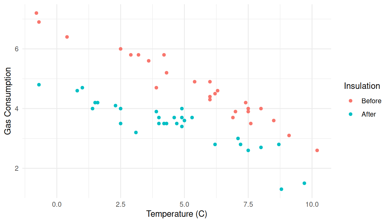 There are several ways we could show confidence intervals for the
expected response or prediction intervals.
There are several ways we could show confidence intervals for the
expected response or prediction intervals.
d <- expand.grid(Insul = c("Before","After"), Temp = seq(-1, 11, by = 1))
d <- cbind(d, predict(m, newdata = d, interval = "confidence"))
head(d)
Insul Temp fit lwr upr
1 Before -1 7.247 6.934 7.561
2 After -1 5.002 4.724 5.280
3 Before 0 6.854 6.581 7.127
4 After 0 4.724 4.487 4.961
5 Before 1 6.461 6.227 6.694
6 After 1 4.446 4.247 4.644p <- p + geom_line(aes(y = fit), data = d)
plot(p)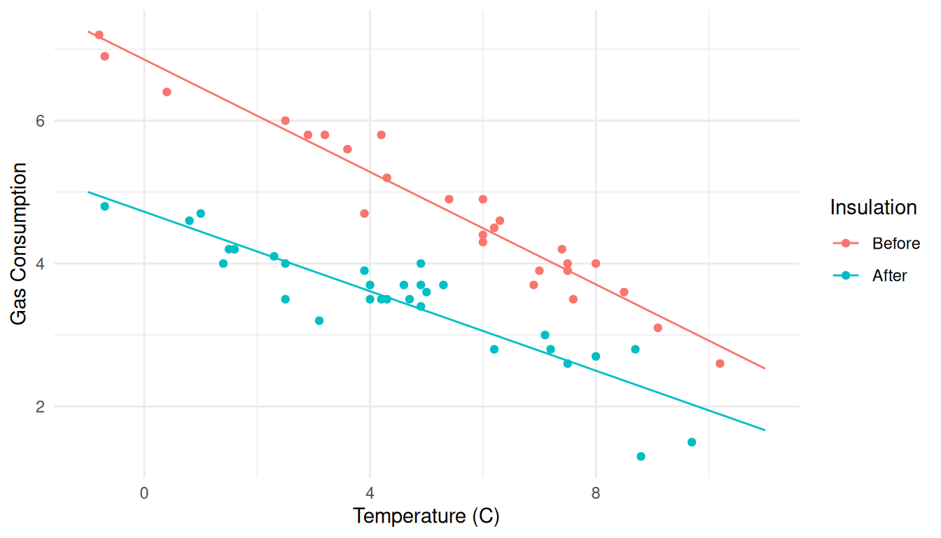
p <- p + geom_errorbar(aes(y = NULL, ymin = lwr, ymax = upr), width = 0.25, data = d)
plot(p)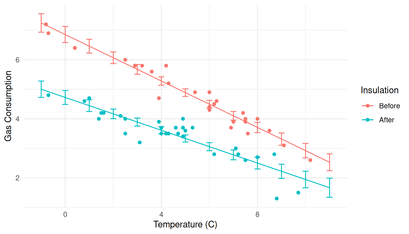 Here’s another approach using confidence intervals for the expected
response.
Here’s another approach using confidence intervals for the expected
response.
d <- expand.grid(Insul = c("Before","After"), Temp = seq(-1, 11, length = 100))
d <- cbind(d, predict(m, newdata = d, interval = "confidence"))
p <- ggplot(MASS::whiteside, aes(x = Temp, y = Gas, color = Insul)) +
geom_point() + theme_minimal() +
labs(x = "Temperature (C)", y = "Gas Consumption", color = "Insulation") +
geom_line(aes(y = fit), data = d) +
geom_ribbon(aes(y = NULL, ymin = lwr, ymax = upr, fill = Insul),
alpha = 0.25, color = NA, data = d, show.legend = FALSE)
plot(p)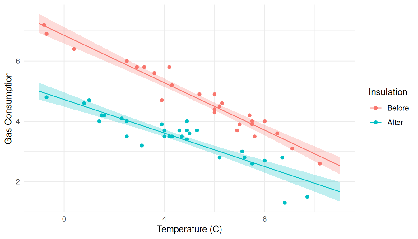 Same approach but now for prediction intervals.
d <- expand.grid(Insul = c("Before","After"), Temp = seq(-1, 11, length = 100))
d <- cbind(d, predict(m, newdata = d, interval = "prediction"))
p <- ggplot(MASS::whiteside, aes(x = Temp, y = Gas, color = Insul)) +
geom_point() + theme_minimal() +
labs(x = "Temperature (C)", y = "Gas Consumption", color = "Insulation") +
geom_line(aes(y = fit), data = d) +
geom_ribbon(aes(y = NULL, ymin = lwr, ymax = upr, fill = Insul),
alpha = 0.25, color = NA, data = d, show.legend = FALSE)
plot(p)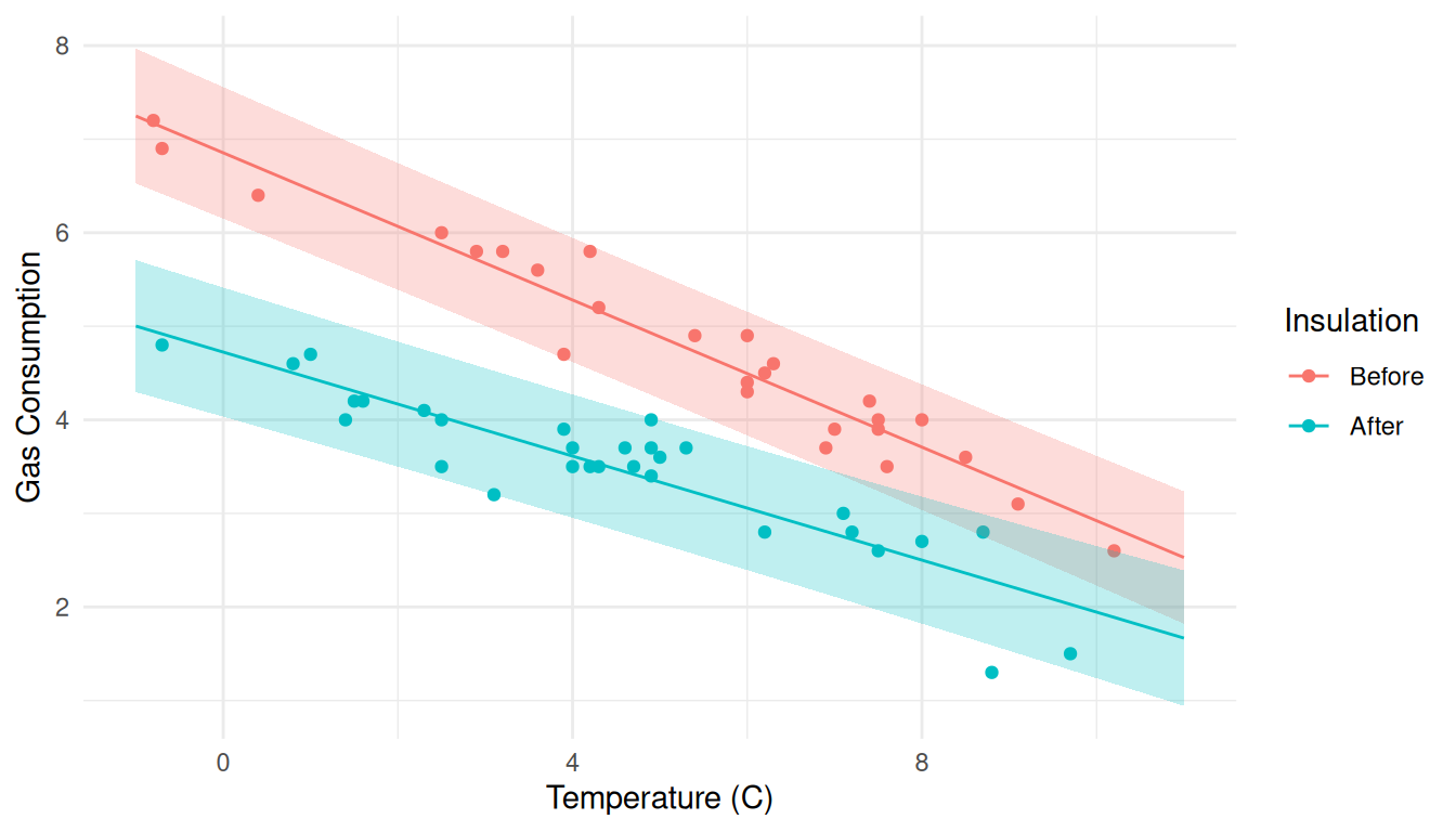 We can put them together, and move the legend.
d1 <- expand.grid(Insul = c("Before","After"), Temp = seq(-1, 11, length = 100))
d1 <- cbind(d1, predict(m, newdata = d1, interval = "confidence"))

d2 <- expand.grid(Insul = c("Before","After"), Temp = seq(-1, 11, length = 100))
d2 <- cbind(d2, predict(m, newdata = d2, interval = "prediction"))

p <- ggplot(MASS::whiteside, aes(x = Temp, y = Gas, color = Insul)) +
  geom_point() + theme_minimal() +
  labs(x = "Temperature (C)", y = "Gas Consumption", color = "Insulation") +
  geom_line(aes(y = fit), data = d1) +
  geom_ribbon(aes(y = NULL, ymin = lwr, ymax = upr, fill = Insul),
    alpha = 0.25, color = NA, data = d1, show.legend = FALSE) +
  geom_ribbon(aes(y = NULL, ymin = lwr, ymax = upr, fill = Insul),
    alpha = 0.25, color = NA, data = d2, show.legend = FALSE) +
  theme(legend.position = "inside", legend.position.inside = c(0.8,0.8))
plot(p)
Black and white for the color printer challenged.
d1 <- expand.grid(Insul = c("Before","After"), Temp = seq(-1, 11, length = 100))
d1 <- cbind(d1, predict(m, newdata = d1, interval = "confidence"))

d2 <- expand.grid(Insul = c("Before","After"), Temp = seq(-1, 11, length = 100))
d2 <- cbind(d2, predict(m, newdata = d2, interval = "prediction"))

p <- ggplot(MASS::whiteside, aes(x = Temp, y = Gas)) +
  geom_point(size = 1) + theme_minimal() + facet_wrap(~ Insul) +
  labs(x = "Temperature (C)", y = "Gas Consumption") +
  geom_line(aes(y = fit), data = d1) +
  geom_ribbon(aes(y = NULL, ymin = lwr, ymax = upr), fill = "black",
    alpha = 0.25, color = NA, data = d1, show.legend = FALSE) +
  geom_ribbon(aes(y = NULL, ymin = lwr, ymax = upr), fill = "black",
    alpha = 0.25, color = NA, data = d2, show.legend = FALSE)
plot(p)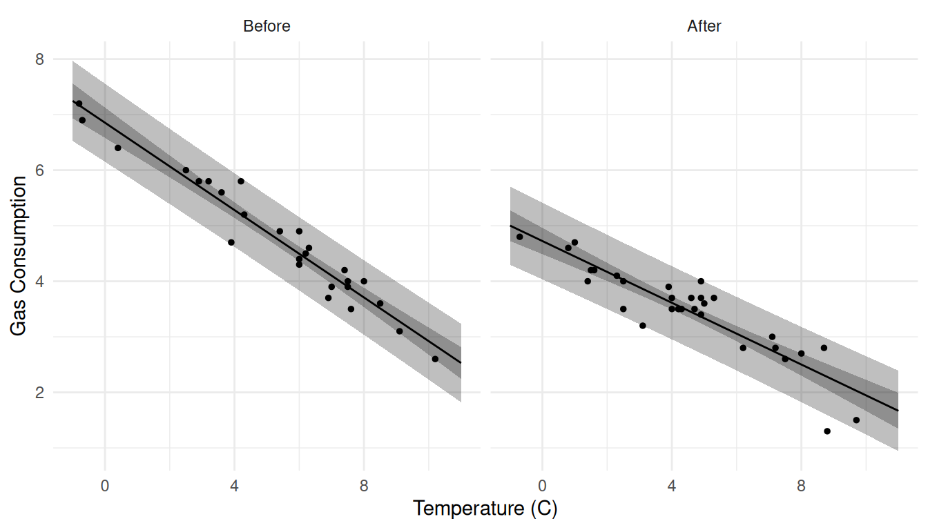
Example: Consider visualizing several models for the
trees data. How do we deal with having two quantitative
explanatory variables?
m <- lm(Volume ~ Height + Girth, data = trees)
d <- expand.grid(Height = seq(63, 87, length = 100), Girth = c(8, 13, 18))
d <- cbind(d, predict(m, newdata = d, interval = "confidence"))
p <- ggplot(d, aes(x = Height, y = fit)) + theme_minimal() +
geom_line() + facet_wrap(~ Girth) +
geom_ribbon(aes(ymin = lwr, ymax = upr), alpha = 0.25) +
labs(x = "Height (ft)", y = "Expected Volume (cubic feet)")
plot(p)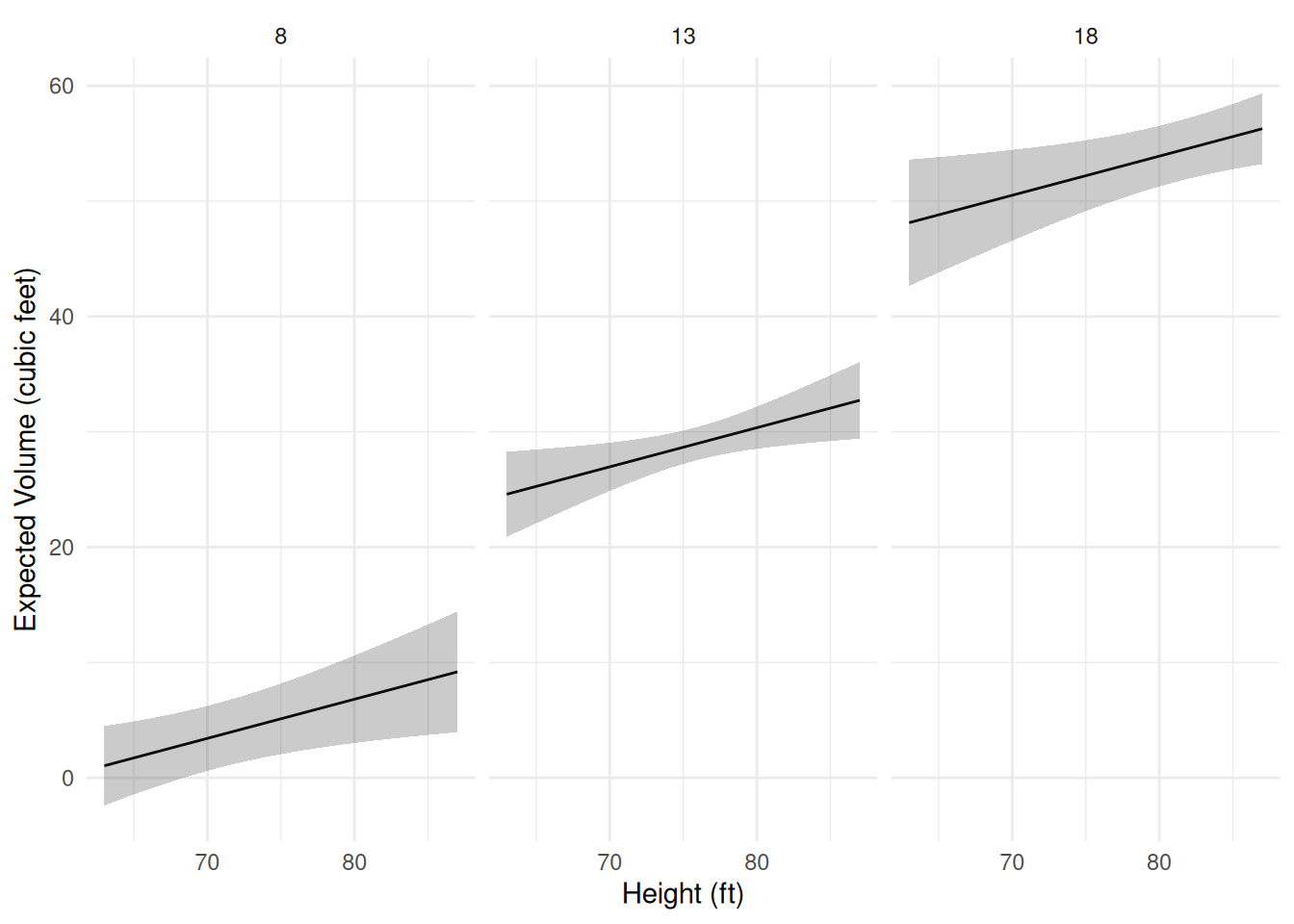 Now suppose there is a third categorical variable
Species.
set.seed(123)
trees$Species <- sample(c("A","B"), 31, TRUE)
head(trees)
Girth Height Volume Species
1 8.3 70 10.3 A
2 8.6 65 10.3 A
3 8.8 63 10.2 A
4 10.5 72 16.4 B
5 10.7 81 18.8 A
6 10.8 83 19.7 Bm <- lm(Volume ~ Height + Girth + Height:Species + Girth:Species, data = trees)
summary(m)$coefficients Estimate Std. Error t value Pr(>|t|)
(Intercept) -58.67683 9.12536 -6.4301 8.195e-07
Height 0.37798 0.14777 2.5579 1.670e-02
Girth 4.55074 0.34654 13.1320 5.542e-13
Height:SpeciesB -0.07239 0.09906 -0.7307 4.715e-01
Girth:SpeciesB 0.39908 0.56071 0.7117 4.830e-01d <- expand.grid(Height = seq(63, 87, length = 100), Girth = c(8, 13, 18), Species = c("A","B"))
d <- cbind(d, predict(m, newdata = d, interval = "confidence"))
p <- ggplot(d, aes(x = Height, y = fit)) + theme_minimal() +
geom_line() + facet_grid(Species ~ Girth) +
geom_ribbon(aes(ymin = lwr, ymax = upr), alpha = 0.25) +
labs(x = "Height (ft)", y = "Expected Volume (cubic feet)")
plot(p)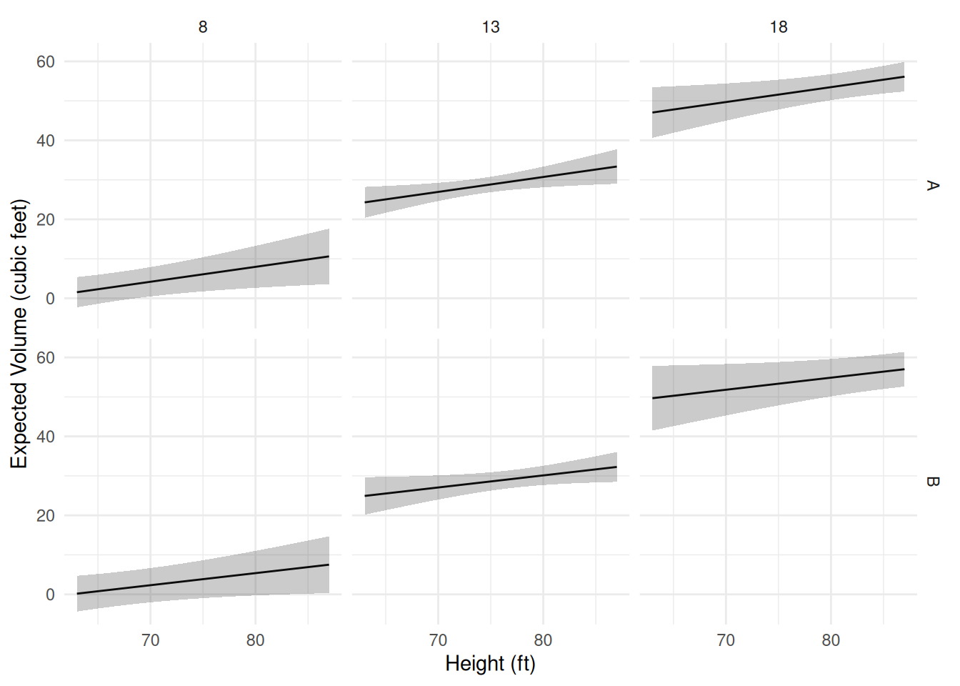 The help file for trees (see
 ?trees) suggests the model
E(Vi)=β1hig2i, which might be reasonable if we think of a tree as being
approximately a cylinder or a cone and assume that expected volume is
approximately proportional to the volume of a cylinder (π(g/2)2h or πg2h/4) or cone (πg2h/6), noting that girth is
diameter in this data set. Note that both volumes are proportional
to g2h. So the expected
volume could be written as E(Vi)=β0+β1xi, where β0=0 and
xi=hig2i, where β1 “absorbs” any constants in the
volume calculation and also necessary due to the units used to measure
these quantities. To specify hig2i as an explanatory variable, we
need to use I() to keep R from misinterpreting interpret
’*’ and ‘^’ anything other than the mathematical operators.
m <- lm(Volume ~ -1 + I(Height*Girth^2), data = trees)
summary(m)$coefficients Estimate Std. Error t value Pr(>|t|)
I(Height * Girth^2) 0.002108 2.722e-05 77.44 4.137e-36d <- expand.grid(Height = seq(63, 87, length = 100), Girth = c(8, 13, 18))
d <- cbind(d, predict(m, newdata = d, interval = "confidence"))
p <- ggplot(d, aes(x = Height, y = fit)) + theme_minimal() +
geom_line() + facet_wrap(. ~ Girth) +
geom_ribbon(aes(ymin = lwr, ymax = upr), alpha = 0.25) +
labs(x = "Height (ft)", y = "Expected Volume (cubic feet)")
plot(p)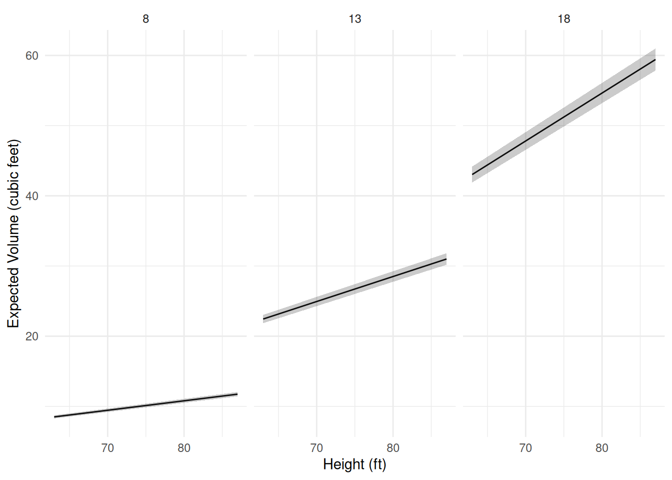 Now suppose we specify the following model.
m <- lm(Volume ~ -1 + I(Height*Girth^2):Species, data = trees)
summary(m)$coefficients Estimate Std. Error t value Pr(>|t|)
I(Height * Girth^2):SpeciesA 0.002094 3.505e-05 59.72 6.526e-32
I(Height * Girth^2):SpeciesB 0.002131 4.425e-05 48.17 3.132e-29We can see that this model is E(Vi)=β1hig2iai+β2hig2ibi, where ai={1,if the i-th observation is of species A,0,otherwise, bi={1,if the i-th observation is of species B,0,otherwise, so we can write the model as E(Vi)={β1hig2i,if the i-th observation is of species A,β2hig2i,if the i-th observation is of species B.
d <- expand.grid(Height = seq(63, 87, length = 100), Girth = c(8, 13, 18), Species = c("A","B"))
d <- cbind(d, predict(m, newdata = d, interval = "confidence"))

p <- ggplot(d, aes(x = Height, y = fit)) + theme_minimal() +
  geom_line() + facet_grid(Species ~ Girth) +
  geom_ribbon(aes(ymin = lwr, ymax = upr), alpha = 0.25) +
  labs(x = "Height (ft)", y = "Expected Volume (cubic feet)")
plot(p)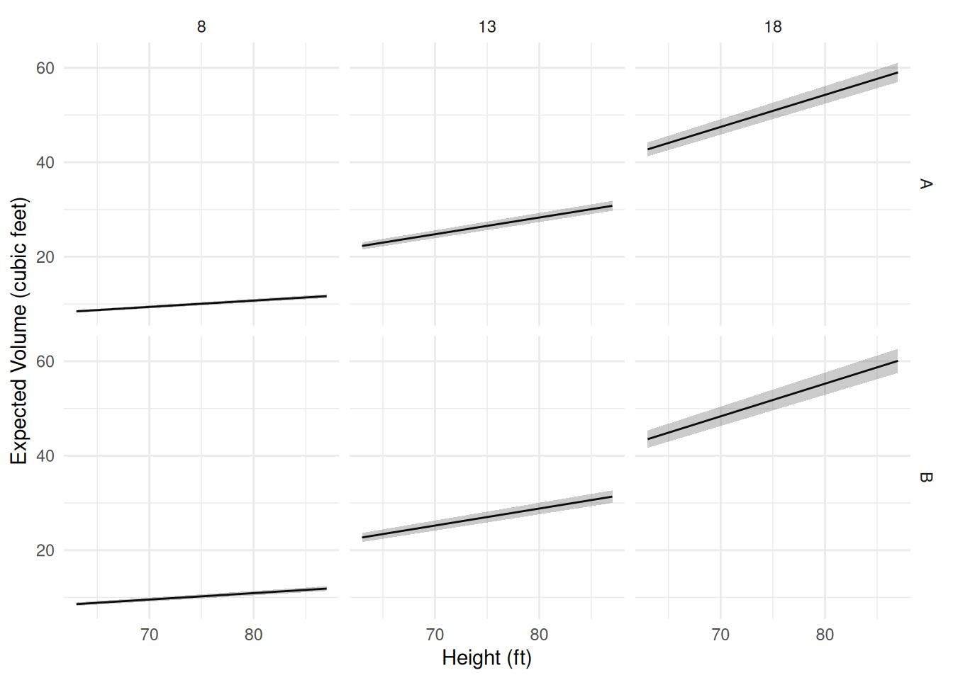 Comparison of the two species:
lincon(m, a = c(-1,1)) # b2 - b1 estimate se lower upper tvalue df pvalue
(-1,1),0 3.786e-05 5.645e-05 -7.759e-05 0.0001533 0.6707 29 0.5077Example: Visualization of models for an experiment on mate preference in female platyfish.
Consider data from an experiment on mate preference in female platyfish.
head(Sleuth3::case0602) Percentage Pair Length
1 43.7 Pair1 35
2 54.0 Pair1 35
3 49.8 Pair1 35
4 65.5 Pair1 35
5 53.1 Pair1 35
6 53.0 Pair1 35p <- ggplot(Sleuth3::case0602, aes(x = Pair, y = Percentage)) +
geom_point(alpha = 0.5) + theme_minimal() + coord_flip() +
labs(x = NULL, y = "Percent Time Spent with Yellow-Tailed Male") +
scale_y_continuous(breaks = seq(0, 100, by = 10), limits = c(0,100))
plot(p)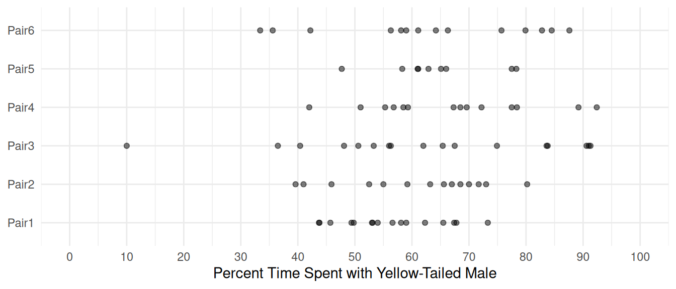 We will specify a model to allow for differences in the expected
response over male pairs.
We will specify a model to allow for differences in the expected
response over male pairs.
m <- lm(Percentage ~ Pair, data = Sleuth3::case0602)
summary(m)$coefficients
Estimate Std. Error t value Pr(>|t|)
(Intercept) 56.406 3.864 14.5965 5.208e-24
PairPair2 4.479 5.657 0.7919 4.308e-01
PairPair3 6.023 5.384 1.1187 2.667e-01
PairPair4 10.594 5.657 1.8727 6.485e-02
PairPair5 7.805 6.441 1.2118 2.292e-01
PairPair6 6.929 5.657 1.2250 2.243e-01Computing and plotting the estimated expected response for each pair.
contrast(m, a = list(Pair = paste("Pair", 1:6, sep = "")),
  cnames = paste("Pair", 1:6, sep = ""))
estimate se lower upper tvalue df pvalue
Pair1 56.41 3.864 48.71 64.10 14.60 78 5.208e-24
Pair2 60.89 4.131 52.66 69.11 14.74 78 2.990e-24
Pair3 62.43 3.749 54.97 69.89 16.65 78 2.114e-27
Pair4 67.00 4.131 58.78 75.22 16.22 78 1.052e-26
Pair5 64.21 5.152 53.95 74.47 12.46 78 3.039e-20
Pair6 63.34 4.131 55.11 71.56 15.33 78 3.006e-25d <- data.frame(Pair = paste("Pair", 1:6, sep = ""))
d <- cbind(d, predict(m, newdata = d, interval = "confidence"))
d Pair fit lwr upr
1 Pair1 56.41 48.71 64.10
2 Pair2 60.89 52.66 69.11
3 Pair3 62.43 54.97 69.89
4 Pair4 67.00 58.78 75.22
5 Pair5 64.21 53.95 74.47
6 Pair6 63.34 55.11 71.56p <- p + geom_errorbar(aes(y = NULL, ymin = lwr, ymax = upr), width = 0.2, data = d)
plot(p)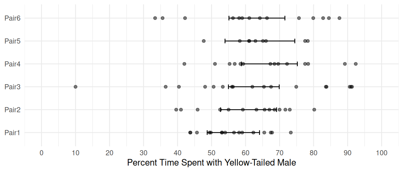 Try replacing
 confidence with prediction to
see prediction intervals.